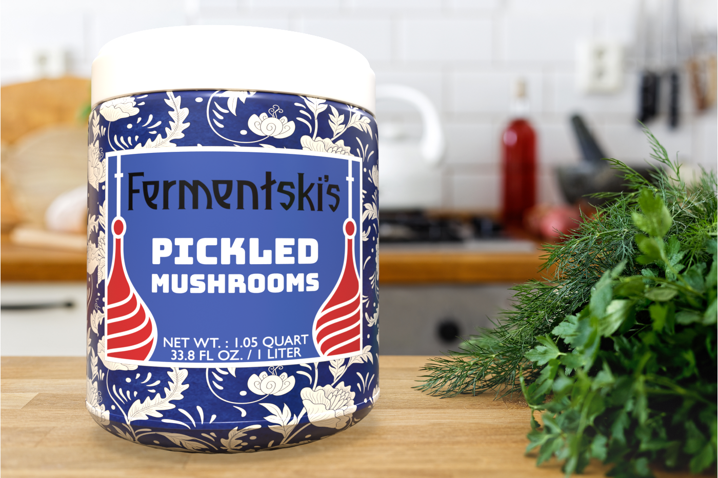
Graphic Design School Project Using 3D Rendering
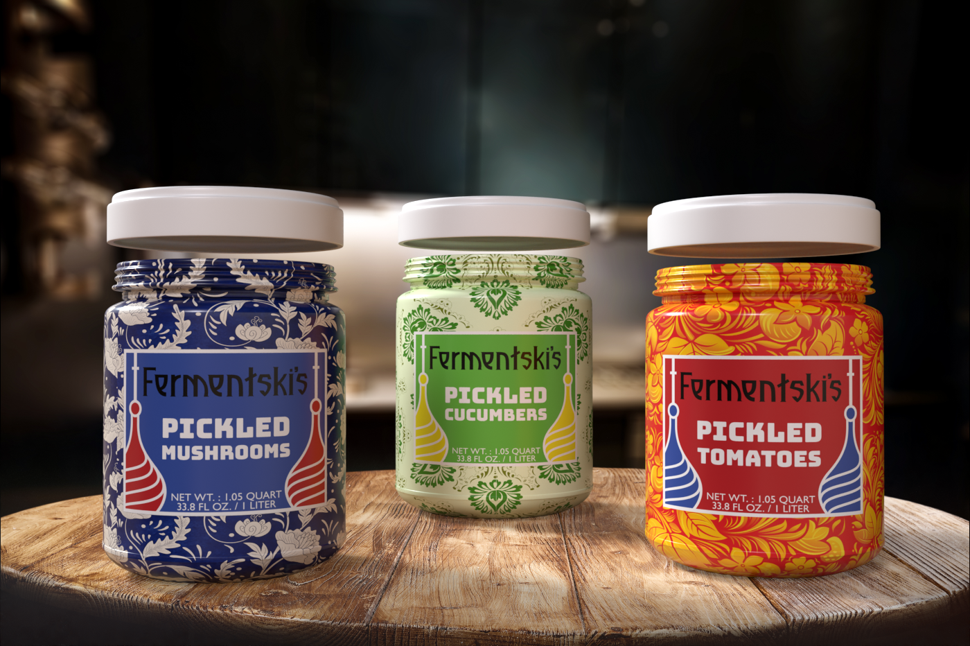
Fermentski's was an idea born initially from my wanderings in my local Russian grocery stores in San Francisco. I found many brands that desperately needed a modern update and a story.
Fermentski's was an idea born initially from my wanderings in my local Russian grocery stores in San Francisco. I found many brands that desperately needed a modern update and a story.
Throughout my travels in Eastern Europe and my family's heritage, I was frequently welcomed by generous hospitality, common cuisine, and welcoming arms and conversations. I wanted to create a brand that reflected the many things Eastern European cultures had in common while welcoming those visiting or merely curious to the dinner table.
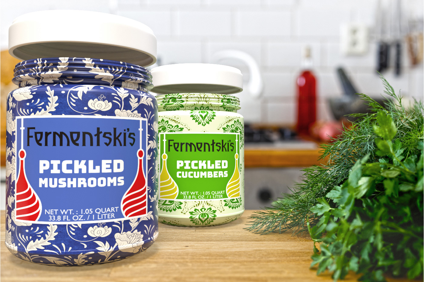
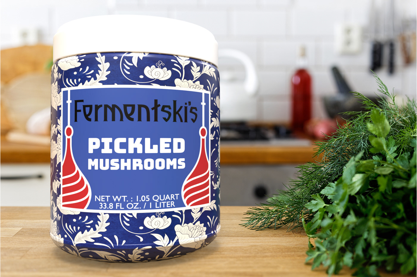
Fermentski's was created as a playful Anglo-Eastern European term on pickled goods that would appeal to English speakers and those from or familiar with Eastern European food. I chose ornate and colorful patterns one would see adorning a dinner table or a living room and Eastern European typefaces that reflected boldness and tradition that welcome you to join in on a meal surely not to be missed.
Below are some photos of my design process and iterations.
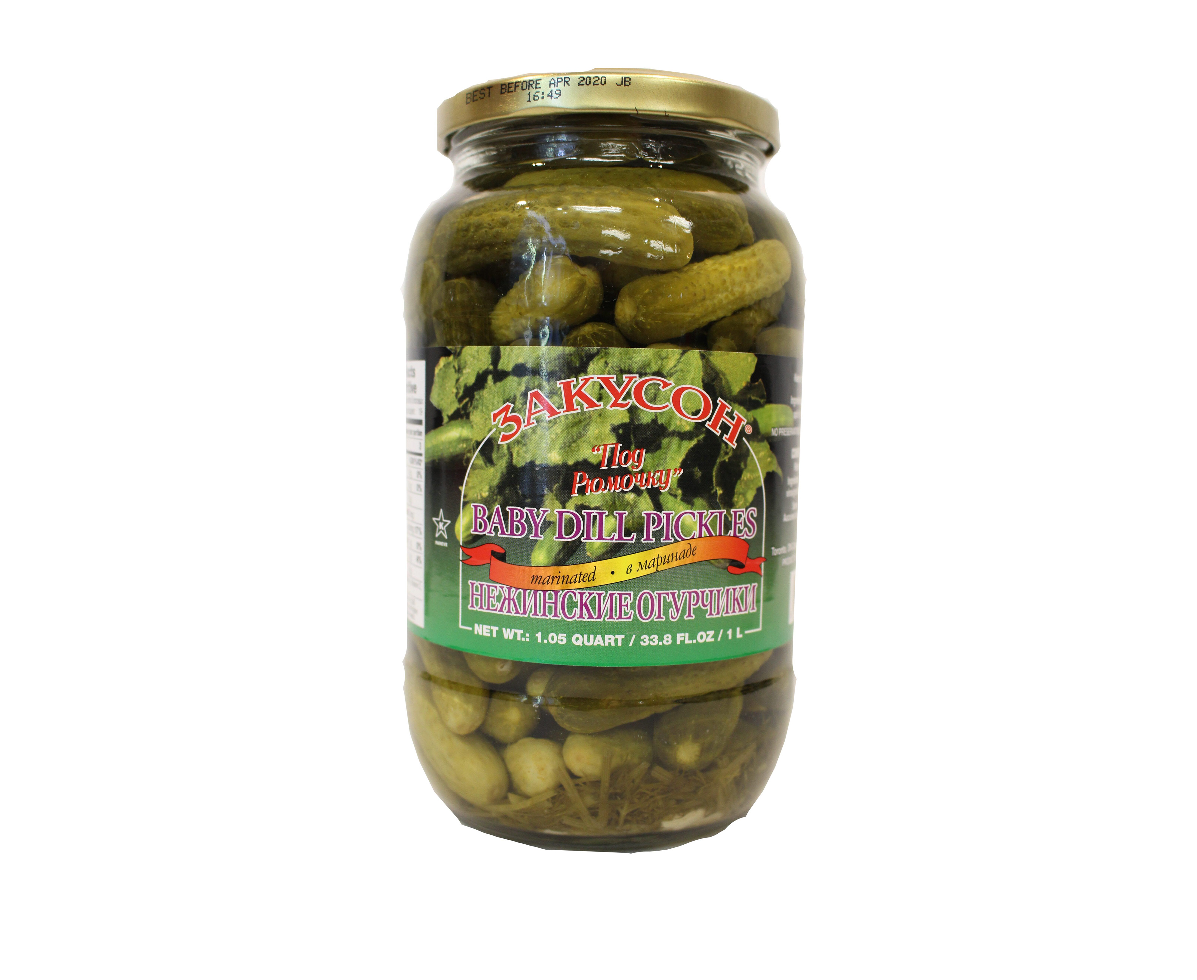
Rebrand inspiration
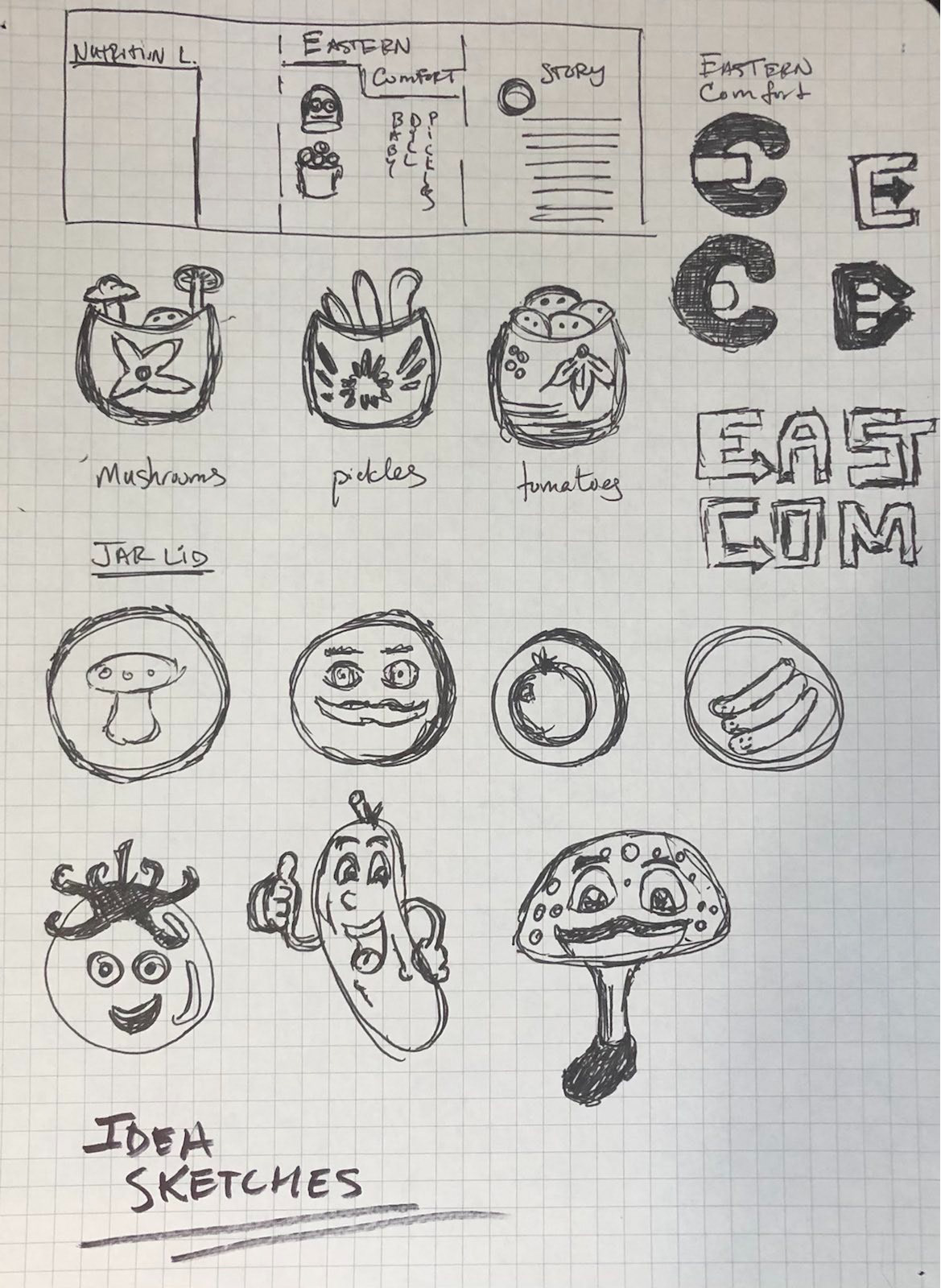
Initial sketches
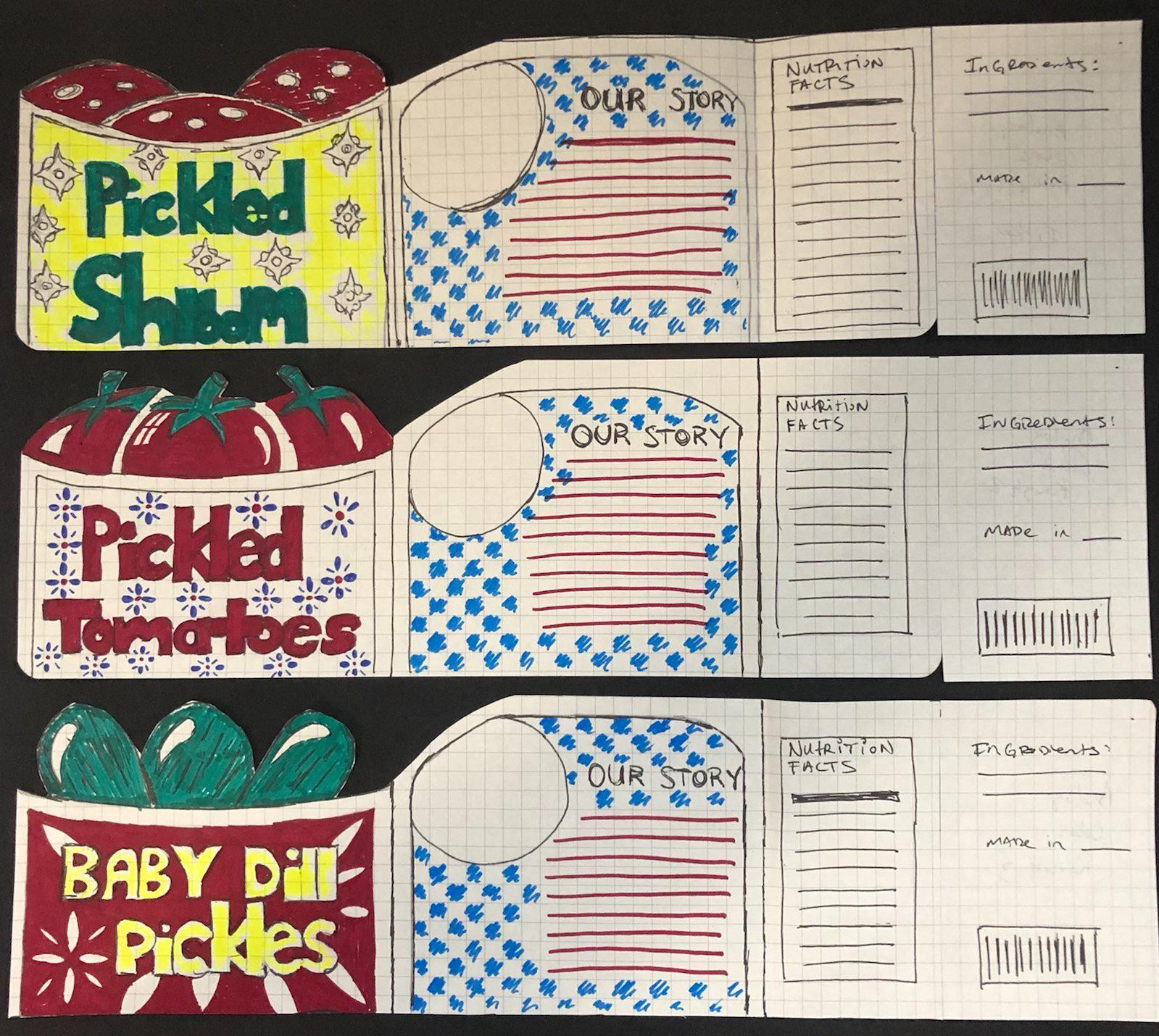
Hand drawn prototype labels
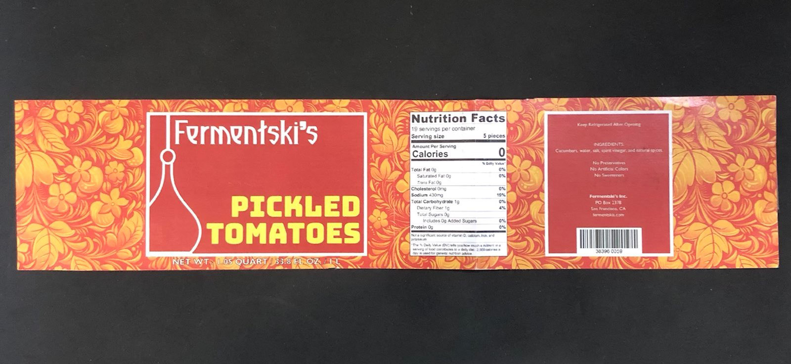
First digital prototype
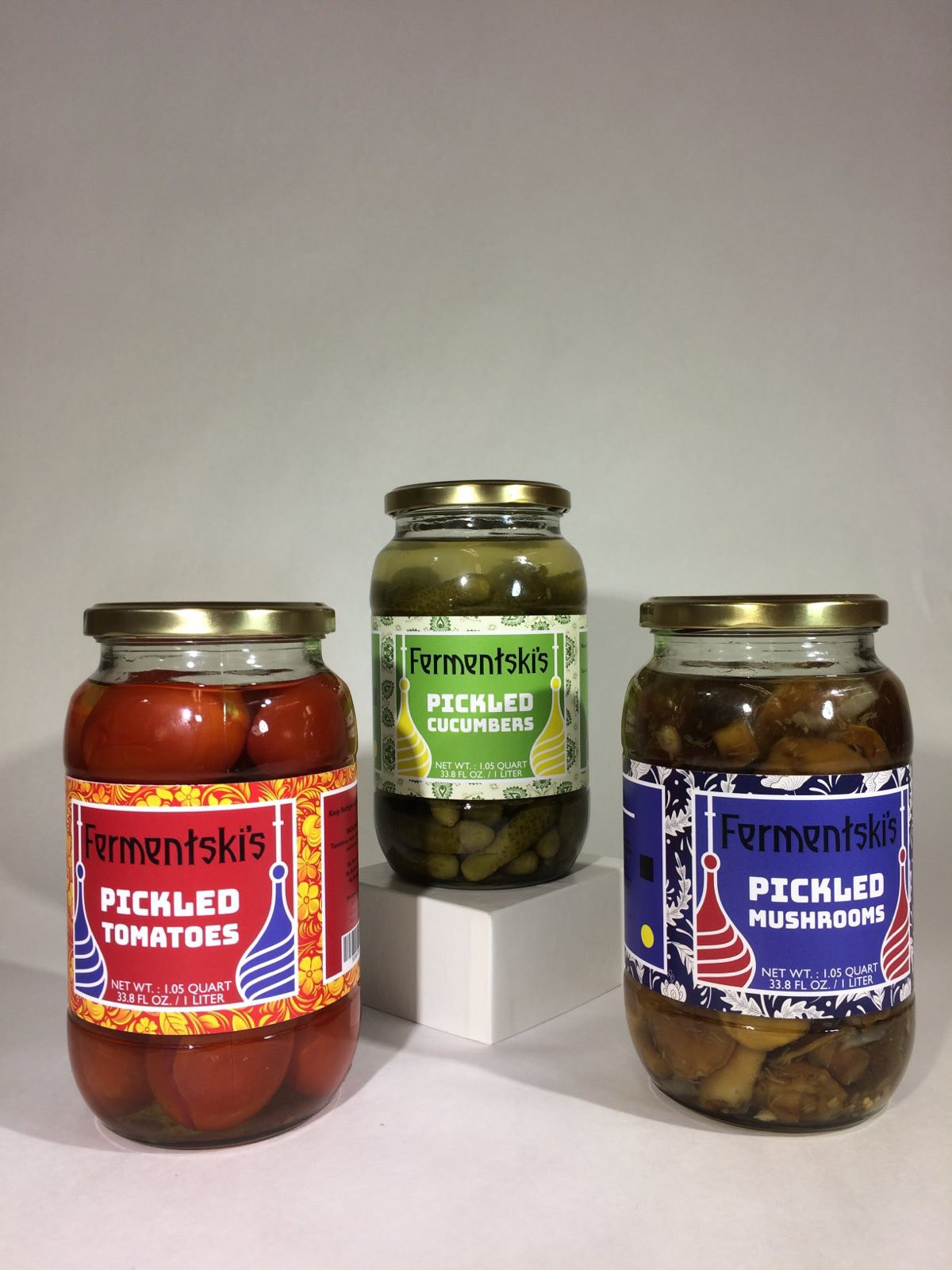
Printed version for my package design class